In this tutorial, we will learn how to make a Pie chart in MS Excel. Pie chart is used to show the distribution of a data. It is in the form of a circle and is divided into slices to show numerical proportion. MS Excel 2021 is used.
Pie chart can be used for a variety number of data. Pie charts are specifically used, when it is necessary to know how a data is divided.
For example: it can be used to graph the division of grades among the students or number of expenditures.
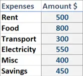
For this tutorial, we will graph the expenses using a Pie chart. The following data will be used to make a pie chart.
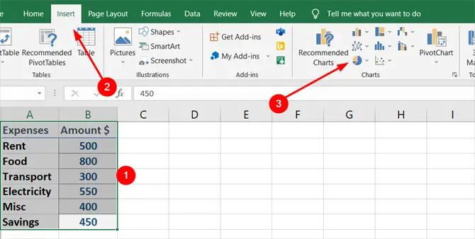
Select all the data, go to Insert tab from the top ribbon and click Insert Pie or Doughnut Chart.
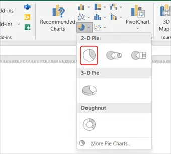
Select the 2D pie chart.
A chart will appear, but it will not have any details on it.
This can be changed from the Chart Design from the top ribbon when you have the chart selected.
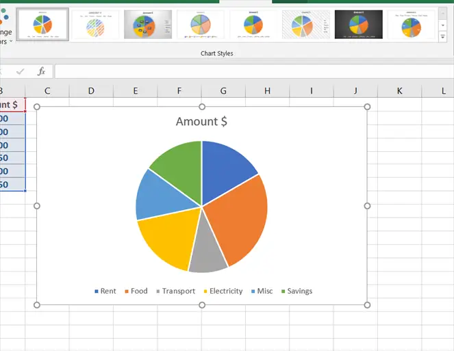
Go to Chart Design and select the chart of your liking.