In this tutorial, we will learn how to make a pareto chart in MS Excel. A pareto chart is the combination of bar chart and line chart. The bar graph represents a values in descending order while line graph represents cummulative total of the values. MS Excel 2021 is used.
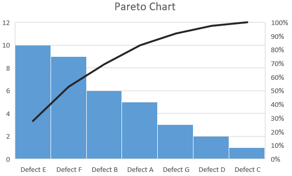
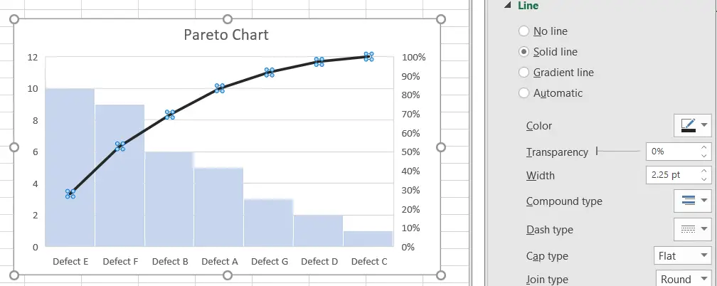
Pareto Chart
Pareto chart are used in Quality control. They are used to highlight the main defects in a system. Using Pareto charts, it can be detemined which defects need to be prioritized.
The left vertical axis is the frequency of how many times a defect has occured, the right vertical axis is the cummulative percentage of total number of defects.
Adding Pareto Chart
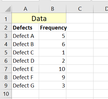
First of all, we have the data for which Pareto chart will be made. The data is divided into two parts, the name of the defect and its frequency.

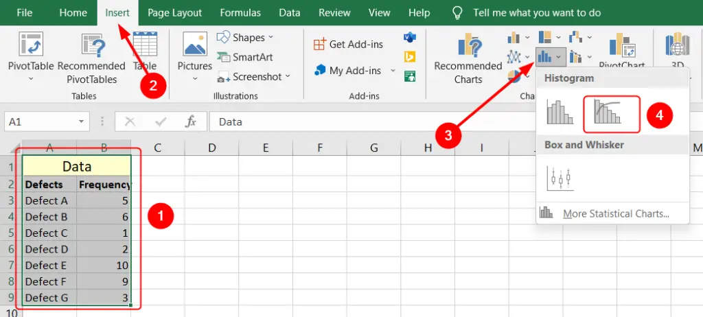
Select all the data, go to Insert tab from the top ribbon, click Insert Statistical Chart and finally select Pareto chart.

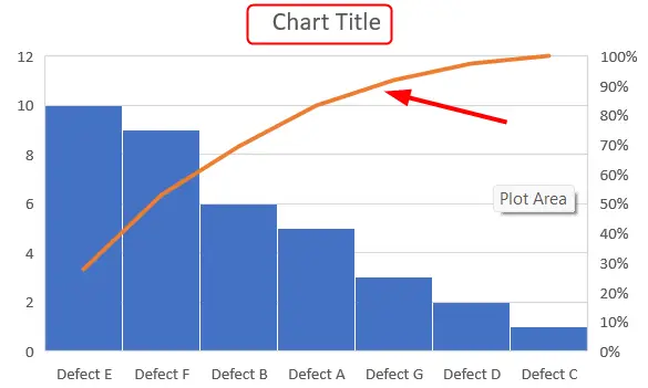
A Pareto chart will be made, but it will need formatting. We can change the title by double clicking it.
Formatting the chart
We can change the format of the line by double clicking it.

When we double click on the chart line, formatting options on the right side of MS Excel show up.
In the Formatting option, you can change the color, width and much more.

The format of the bars of the chart can also be changed by double clicking on it.
You can format the graphs according to your liking.