In this tutorial, we will learn how to make a Histogram in Microsoft Excel. Histogram is used to represent a distribution of data. We will use numerical data to make a Histogram chart. MS Excel 2021 is used.
Histograms are usually used to represent data of any kind, for example, they can be used to represent the Marks obtained by student in a subject.
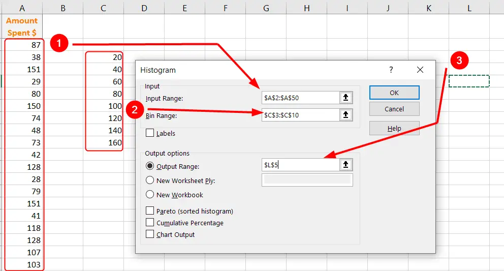
For this tutorial, the Amount Spent by customers in a shop is used as Input Range of data. This data ranges from $20 to $160.

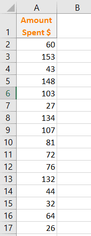
We have 50 values of the data in a column, for which we are going to make a Histogram.
To make a Histogram, we need to have two sets of values.
- Input Range : All the values for which we want to make the histogram, in this case, the amount of money that was spent by each individual.
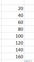
- Bin Range : Also called class interval, it is the range of values which are sorted in a histogram for which Frequency is evaluated.
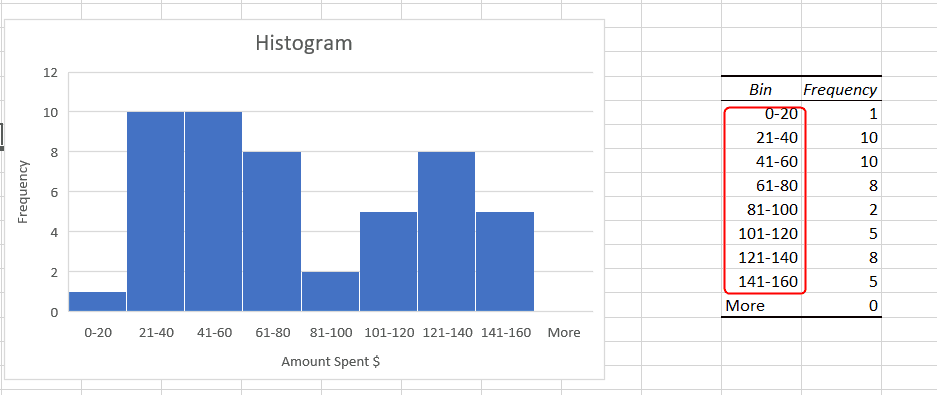
We will need to enter values for the Bin range. We have set the Bin Range as shown in the image. We have set the interval of 20.

Before making Histogram, we need to enable Data Analysis.
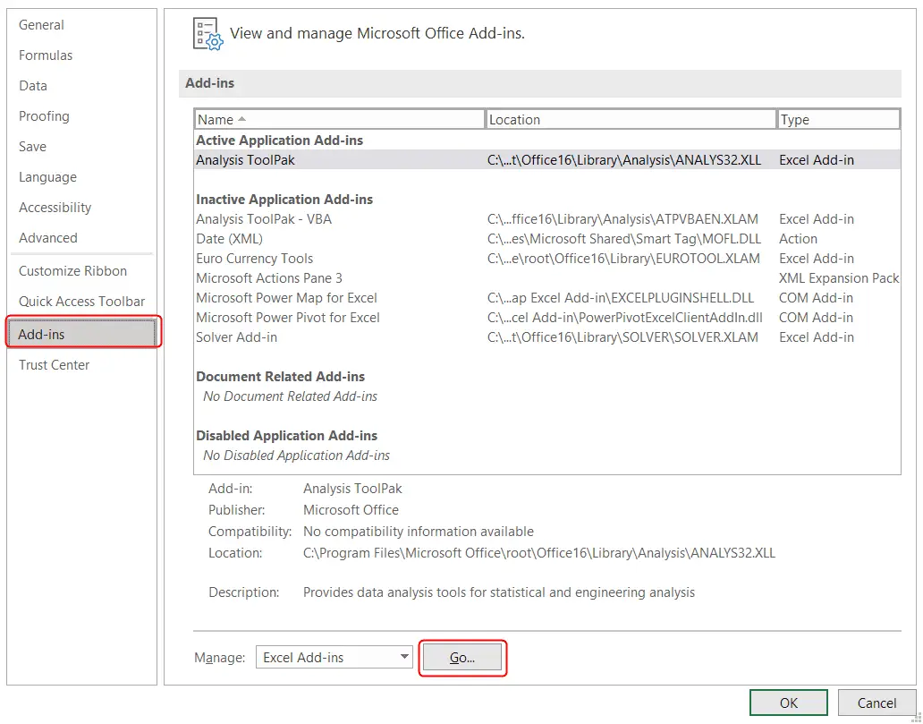
Adding Analysis ToolPak for Data Analysis
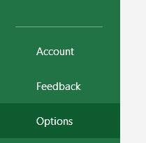
Go to File > Options.

In the Options window, click Add-ins.
Next to Manage, click Go.

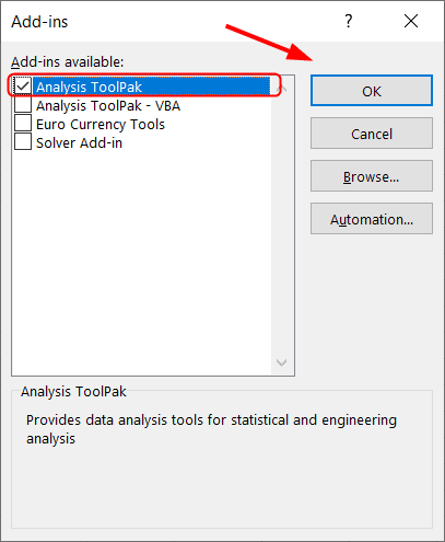
Enable the Analysis ToolPak and click OK.

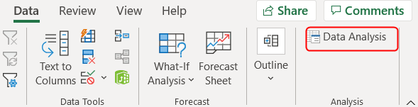
The Data Analysis option is now added in the Data tab on the Ribbon.
Click Data > Analysis > Data Analysis.

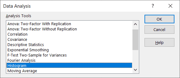
Choose Histogram and click OK.

Evaluating Histogram Data
The Histogram menu will appear, in which you will have to specify these ranges:
Input Range, the whole data for which the histogram is to be represented.Bin Rangespecified earlier.Output Range, this is the cell where you want the output result of the data.
Finally, click OK.

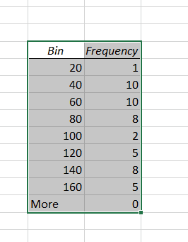
This will have the same output cell that was specified earlier. Bin values are same and the Frequency is how many values have fallen in specific range.

Now, we have the data to make a histogram chart.
Making a Histogram Chart
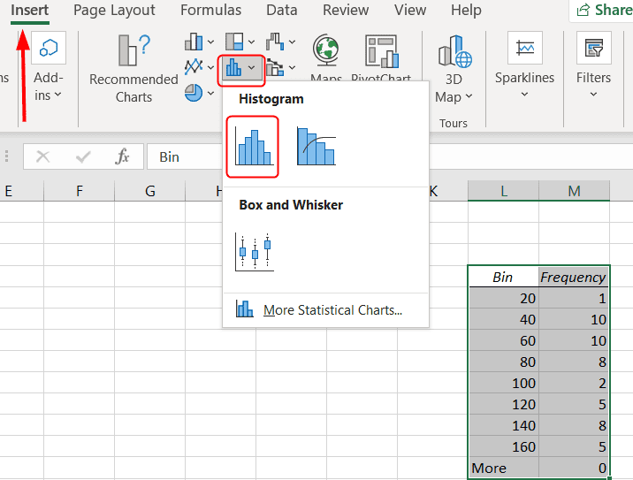
Click Insert tab from the Ribbon.
Select the Histogram from the charts section while keeping all the data selected.

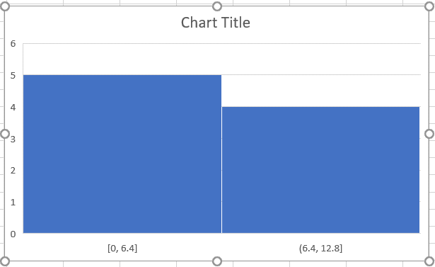
A chart will be made, the chart has only two values in horizontal axis, it should have the bin ranges that we selected. This can be corrected by formatting the Axis.

Press Right Mouse Button on the chart, and click Format Data Series.

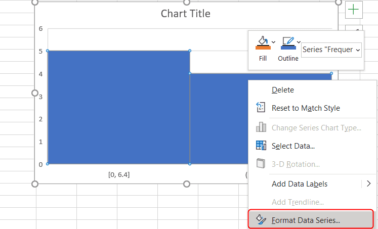
A Format Data Series section will appear on the right side.
In the Series Options, select Horizontal Axis.

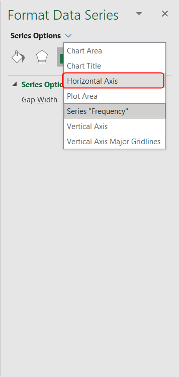
Select By Category in the Bins under Axis Options. The categories “Bins” and “Frequency” were specified when the Histogram data was evaluated.

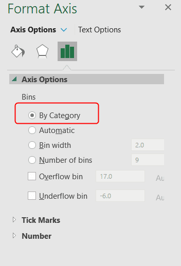
This should now correct the issue.

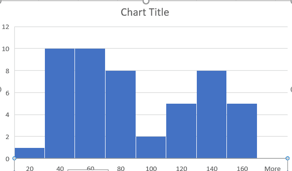
You may define the ranges as follows and add Axis on the Histogram.

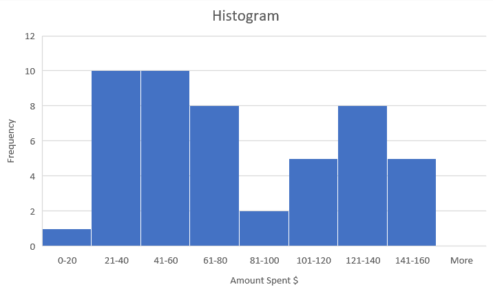
This will how the Histogram will look like.