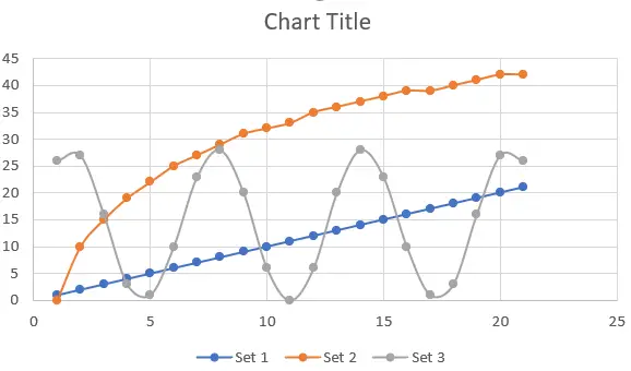
Charts are used to represent a set of data graphically. In this tutorial, we are going to use scatter chart. In a chart, the data points are connected with the help of lines, if we have numerous series, numerous lines are drawn. Lines are distinguished by the color, but we can change the formatting of each line so that the lines can be distinguished by their dash type, markers, width and as well as their color.


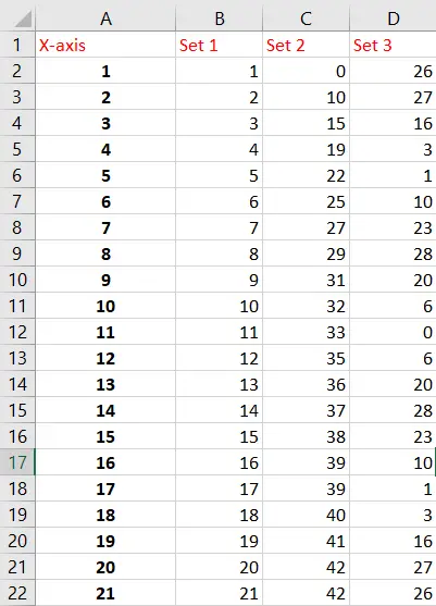
Scatter chart plots the graph using two or more different numeric variables. As in this case, we have four sets of data.

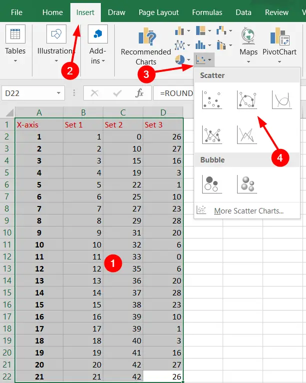
Select all the cells with numbers, and then go to the Insert tab on the ribbon, select the Scatter and select the chart with lines and marker.

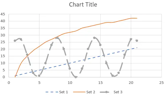
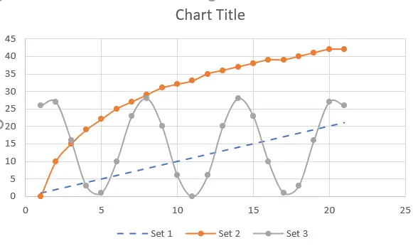
A chart will be displayed. The lines on this chart have different colors but they have same dash type, markers and widths.

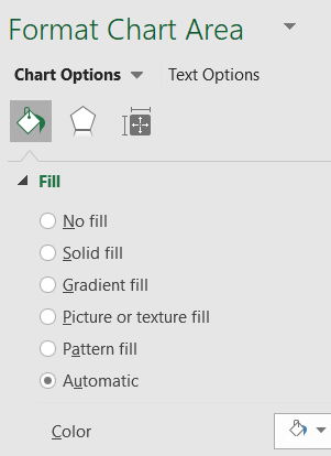
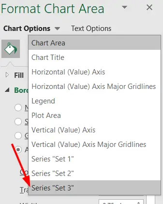
Double-click anywhere on the chart, format options will be shown on the right side of the Sheet.

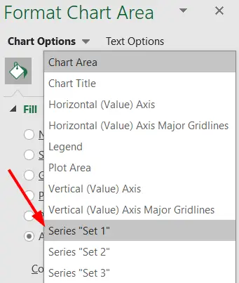
From the chart options, select Series “Set 1” to format the first series.

Under the line options, change the Dash type.

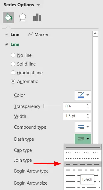
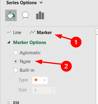
Now, go to Marker tab, and under the Marker Options select None. This will remove any type of marker from the graph

In the chart, the “Set 1” series line has been formatted.

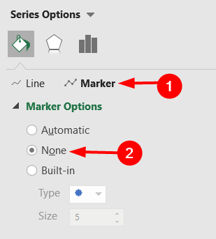
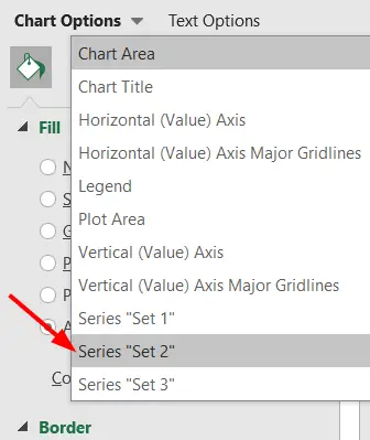
Select Series “Set 2” from the Chart Options. For this series, we are just going to remove the markers.

Select the Marker tab, and under the Marker Options, select None.

Markers from “Set 2” series will be removed.

Now select Series “Set 3” from Chart Options.

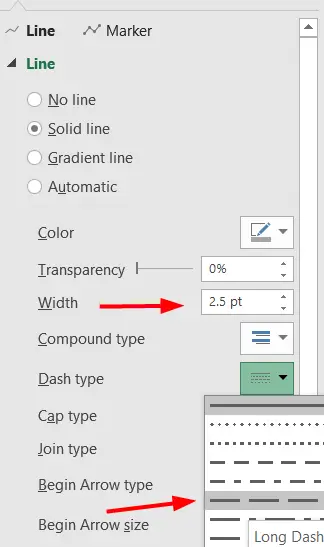
Under the Line, increase the width to 2.5, and change the Dash type to Long Dash.

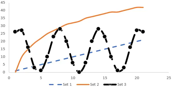
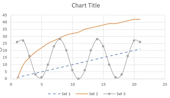
The final result will look like this.